How to Choose Your Home Colors in a Balanced Way
Choosing your home’s colors is one of the most influential decisions in interior design. Colors don’t just decorate your space — they express your personality and define the atmosphere of your home. With so many trends and options available, finding the right balance can be challenging. This guide will help you choose your home colors in a harmonious and well-balanced way.
How to Choose Your Home Colors in a Balanced Way
Choosing your home’s colors is one of the most influential decisions in interior design. Colors don’t just decorate your space — they express your personality and define the atmosphere of your home. With so many trends and options available, finding the right balance can be challenging. This guide will help you choose your home colors in a harmonious and well-balanced way.
The Importance of Balance in Color Selection
Balanced colors create a sense of harmony and make spaces visually comfortable. In contrast, using too many random shades causes visual clutter and confusion. Balance means combining colors in a way that highlights beauty without overwhelming the eye — giving every element its own voice in a cohesive composition.
The Basic Rules of Color Harmony in Interior Design
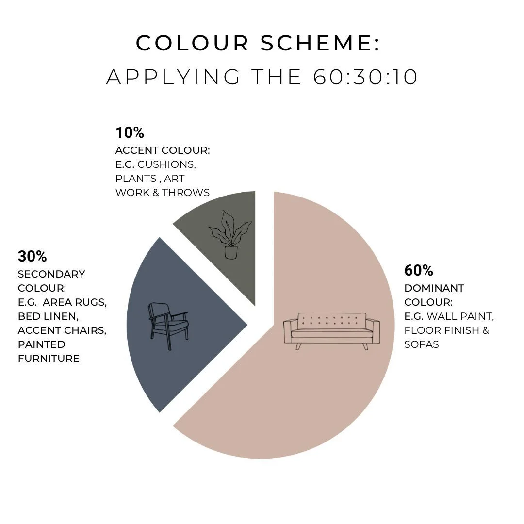
1. The 60-30-10 Rule
A golden rule in modern interior design:
60% Main color: Dominant on walls or flooring.
30% Secondary color: Used in furniture, curtains, or rugs.
10% Accent color: Appears in accessories or artwork to add liveliness.
This proportion ensures perfect visual harmony in any room.
2. Monochrome Palette
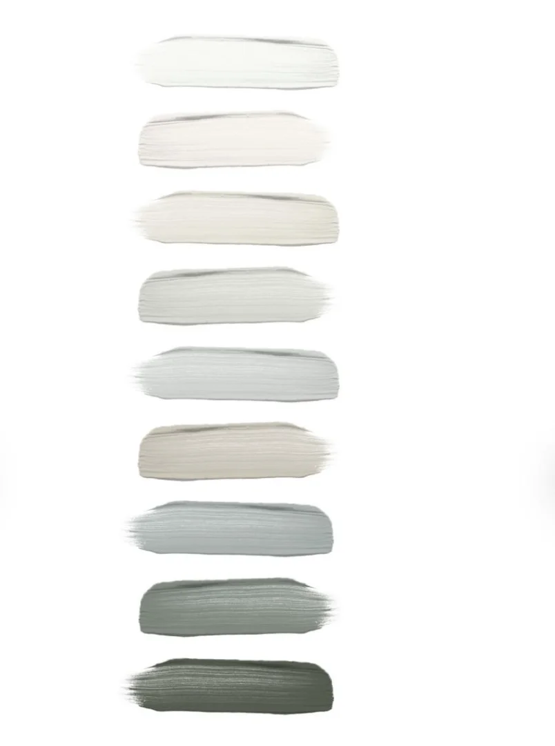
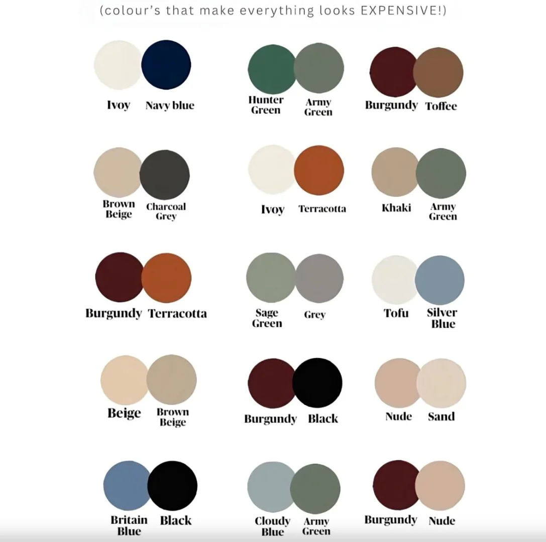
Choose one color and play with its different shades — light, medium, and dark. It creates a calm and sophisticated look. For instance, layering beige or gray tones can achieve a luxurious yet simple atmosphere.
3. Smart Contrast
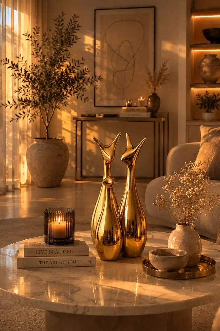
For bold spaces, pair contrasting colors such as white and black, or navy blue with gold. Contrast brings vibrancy, but balance is key to avoid one color overpowering the other.
Practical Tips for Choosing the Right Colors
1. Start from a Fixed Element
Pick one main piece — like a rug, painting, or sofa — and extract your color scheme from it. This method ensures consistency across all design elements.
2. Consider Natural Light
The same color can appear different under morning and evening light. Always test paint samples on a small wall area and observe them throughout the day.
3. Balance Warm and Cool Tones
Mix warm tones (like beige or terracotta) with cool tones (like blue or gray) to create a visually pleasing and comfortable environment.
4. Match Colors with Function
Each room has its own mood:
Bedrooms: Soft and relaxing shades like light blue or gray.
Living rooms: Warm and inviting tones like beige or olive green.
Kitchens: Bright and refreshing hues like white or mint green.
5. Don’t Overlook Neutrals
Neutral tones — white, ivory, gray — make excellent backdrops and allow you to refresh your décor easily with seasonal colors.
Trending Colors in Modern Décor
Earthy Tones: Bring warmth and calm.
Deep Blue: Adds elegance and depth.
Dusty Pink: Perfect for feminine and refined interiors.
Botanical Green: Creates balance and relaxation.
Conclusion
Choosing your home’s color palette is both an art and a science. Achieving balance means blending shades that reflect your personality and create visual harmony. The colors surrounding you daily influence your comfort and emotions — so choose them carefully to make your home a place that radiates beauty and peace.